A Forecasting Experiment

An experiment is the place to iterate over either forecasting jobs or anomaly detection jobs. Forecasting experiments are designed to support users throughout their journey towards a production forecast, covering stages to find the ideal configuration for the use case, examine in-sample and out-of-sample results, inspect models in detail, review accuracy measures and drill down to the root cause behind a particular forecasted value.
Quick forecasting
From anywhere in TIM Studio, a user can trigger a quick forecast. This is done by clicking the 'Quick forecast' action in the navigation bar, or using the ctrl + e shortcut. This gives the user the choice to select or upload a dataset, and allows them to immediately start forecasting with it. When a quick forecast is started, TIM Studio takes care of all actions leading up to this (creating a use case, linking the dataset to it, creating an experiment...) and opens up the experiment.
The forecasting configuration
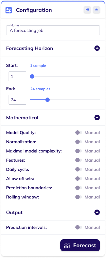
The configuration for a forecasting build-model job can be set in the forecasting configuration card. This card enables the user to configure the job's name, and has sections for configuring its forecasting horizon, its mathematical settings, and its output-related settings. There is a reset button in the card's header ![]() that serves to reset all forecasting configuration settings to their default value. The forecast button at the bottom of the card
that serves to reset all forecasting configuration settings to their default value. The forecast button at the bottom of the card ![]() can be used to submit the job with the chosen configuration.
can be used to submit the job with the chosen configuration.
The image below shows a forecasting build-model configuration card with expanded subsections and all mathematical and output-related settings set to automatic (default).
Forecasting results
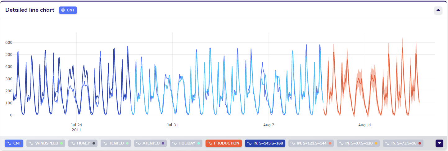
The results in the line chart(s)
The line chart will be updated with the results of the job.
For forecasting, the production forecast is one of those results. The production forecast is the actual forecast the user requested, and is accompanied by prediction intervals. For each bin (more information on bins in this section on forecasting outputs) the in-sample and out-of-sample backtesting results are shown.
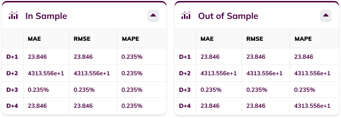
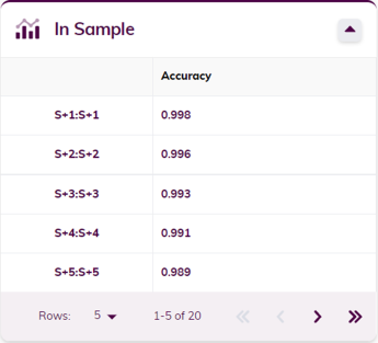
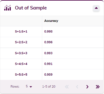
The accuracy metrics
The accuracy metrics cards show the accuracy metrics (error measures) for both in-sample and out-of-sample backtesting, where applicable. Metrics include the MAE (Mean Absolute Error), RMSE (Root Mean Squared Error) and MAPE (Mean Average Percentage Error). The metrics are shown for each of the bins and/or samples ahead.
Root-cause analysis (RCA)

When looking at the results of a forecasting job, the RCA icon ![]() can be found in the actions at the top right of the detailed line chart. By clicking this icon, the user activates RCA on this job's results, allowing the user to drill down the root cause bringing TIM to produce a particular result.
can be found in the actions at the top right of the detailed line chart. By clicking this icon, the user activates RCA on this job's results, allowing the user to drill down the root cause bringing TIM to produce a particular result.
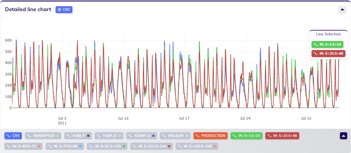
To perform root-cause analysis on a specific value, the user should click on the value - the point in the line chart - that they are interested in. The timestamp of this selected value can possibly be linked to multiple results, such as in-sample and out-of-sample bins, in-sample and out-of-sample forecasts for different amounts of samples ahead and a production forecast. Selecting a timestamp will open up a line selection pop-up as shown below, allowing the user to select the specific result - or line in the chart - that they want to inspect. Clicking on the desired option triggers an ML request specifically for RCA, of which TIM Studio will then show how the calculation progresses.
After the results have been calculated and processed, the user can continue by interpreting the results. The RCA results are displayed in a pop-up, as shown below. This pop-up is composed of multiple parts, each of which is explained below the visual example of results.
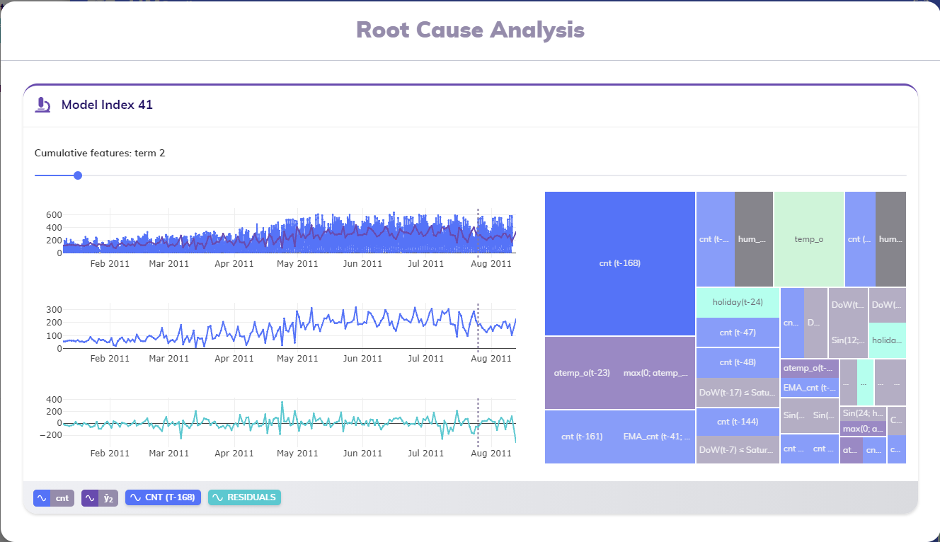
The RCA card's title indicates the model that was used to generate the result the user is looking into. In the example above, the model with index 41 was used to calculate the result that is being analyzed.
The visuals inside the RCA card give a cumulative view into how this model was built. Each model is composed of multiple terms, gradually achieving a better fit to the training data. When initially viewing these results, the results are being shown as if the model only consisted of two terms: the intercept and the most important term (the term with the highest contribution) in the treemap. In the example above, this term is cnt (t-168), or the value of the variable cnt of 168 samples ago.
The slider
As explained above, these visuals give a cumulative view into the composition of a particular model. The active view always focusses on a single term: the last term added in the cumulative view. The slider at the top of the card (right below the title) indicate which term is currently highlighted - term 2 in the example - and allow the user to browse through the terms cumulatively. At the leftmost side, the results that are shown relate to a model composed of a single term (the intercept); at the rightmost side, the results that are shown relate to the last term included to get to the entire model as it is used to generate results.
The line charts
The RCA card in the example above shows three line charts: one for the (partial) model, one for the term in focus and one for the residuals. This section discusses them one by one.
The top line chart displays the historical actuals of the target variable around the selected timestamp, together with the results of the cumulative model up until the current point (as selected in the slider). This provides a visual way to see how close the partial model approximates the historical actuals. A grey dashed vertical line indicates the active timestamp that was selected when triggering the RCA calculation.
The middle line chart displays the term in focus. Again, the active timestamp is indicated by a grey dashed vertical line.
The bottom line chart displays the residuals; calculated as the difference between the historical actuals of the target variable and the results of the cumulative model up until the current point (as selected in the slider).
The three line charts are synchronized and thus allow for easy horizontal zooming and panning.
The treemap
At the righthand side of the RCA card, the feature importances treemap of the model used to come to the inspected result is shown. This treemap displays an overview of all features in this model, and which of them are included in the cumulative model up until the current point (as selected in the slider): features that are included are shown clearly, while features that are as of yet excluded are slightly blurred. In the example above only the most important feature (with the highest contribution, cnt (t-168)) is shown without blur.
This treemap is interactive: clicking on any feature in the treemap selects it, and thus shows that feature and the results related to the first cumulative model that includes it.
The legend
The footer bar of the RCA card contains the legend of the lines shown in the different line charts. The first two pills are related to the first line chart and show the target variable and the result being focused on, i.e. the result calculated with the cumulative model up until the current point (as selected in the slider or treemap).
The third pill shows the feature in focus, the name of which is also represents one of the rectangles in the treemap. This pill can be used to (de)select the second line chart, which shows this feature.
The last pill shows represents the residuals shown in the bottom line chart, and can be used to (de)select this line chart.
Classification
When a categorical variable is selected as target variable (currently supported categorical variables are booleans), TIM will recognize this and perform binary classification on this target variable. A forecasting experiment that is handled as a classification is indicated by the forecasting pill being updated to a classification pill.
Classification results will be visualized in the same way as forecasting results are, and the models are also built up the same way. The accuracy measures are different, however: instead of showing error measures, the accuracy will be displayed in the cards for each of the bins and/or samples ahead.
Production evaluation view mode
The production evaluation view mode visualizes the results of a sequence of jobs. Once a satisfying model has been built, this is typically used in production for a while, as the basis or root of a sequence. Such a sequence would include the model building job itself, but also any jobs based on this job, which may include prediction jobs, model rebuilding jobs, model retraining jobs and even model uploading jobs.
There are two ways to navigate to the production evaluation view mode of a forecasting job:
one way is to use the view mode menu when a job is selected (its results are shown) to view that job's sequence (navigating to this view mode will be disabled if no job is selected), and

a second way is to use the job's menu in the iterations table to view that job's sequence.

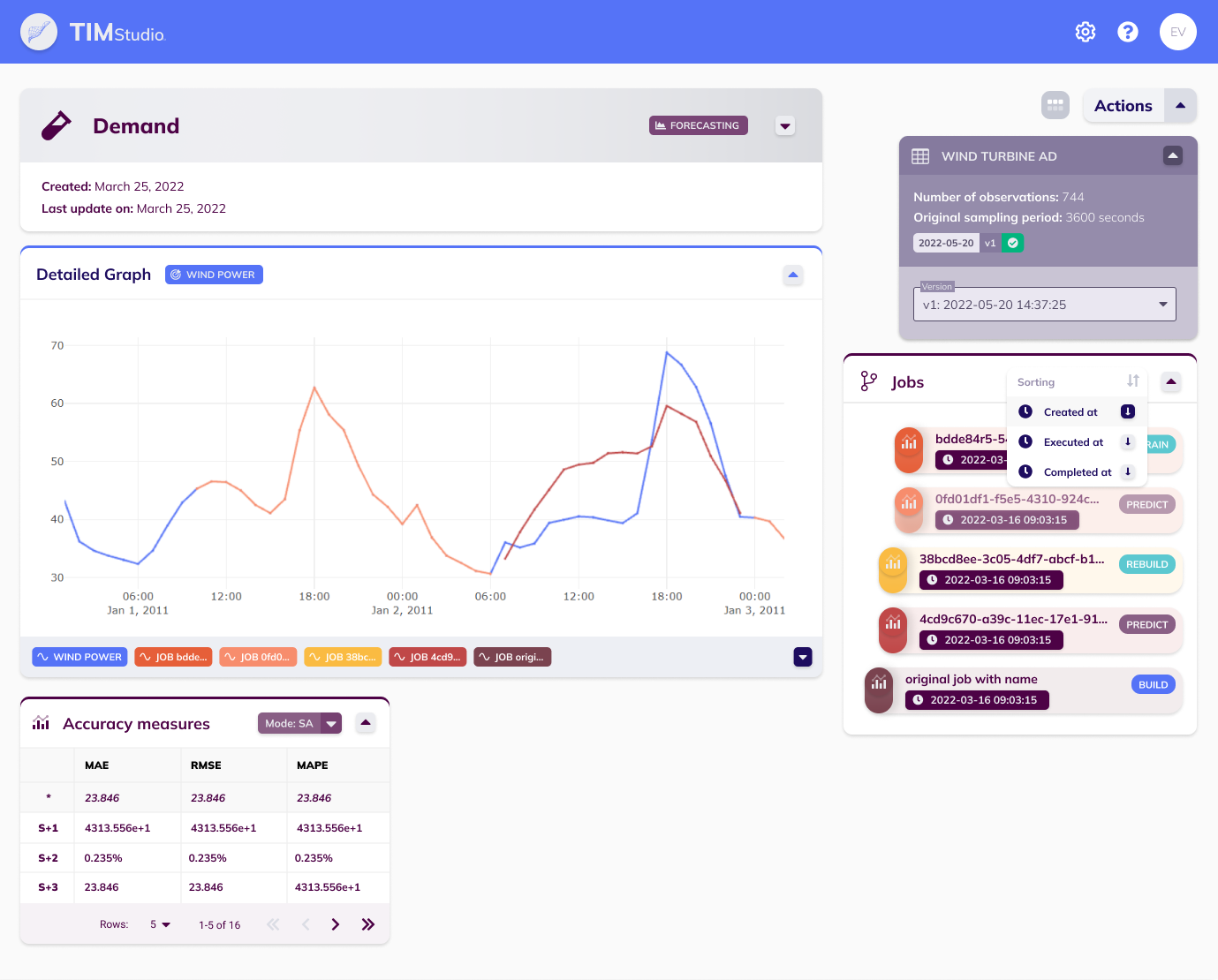
The production evaluation view mode looks like the image above. It contains the familiar detail card with the experiment's name, type, date of creation and update, and when expanded, its description. It also contains a minimal version of the dataset overview button that expands into the data configuration card, that allows changing the dataset version the sequence is being evaluated against.
This view mode shows a line chart containing the target variable (from the selected dataset version) and each job's production forecast. Next to this line chart, under the data configuration card, a card can be found that displays all the jobs in the sequence. The jobs' colors match those in the line chart for easy visual identification, and the jobs' indentation levels show their hierarchy in the sequence (parents - children). For each job, the datetime of creation and type is shown too. The card's header contains a sorting menu, allowing users to change the order of the job list. Under the line chart, the sequence's accuracy measures card is shown. This card contains overall accuracy metrics over the whole sequence, and gives the user insight into the overall performance of this production sequence.