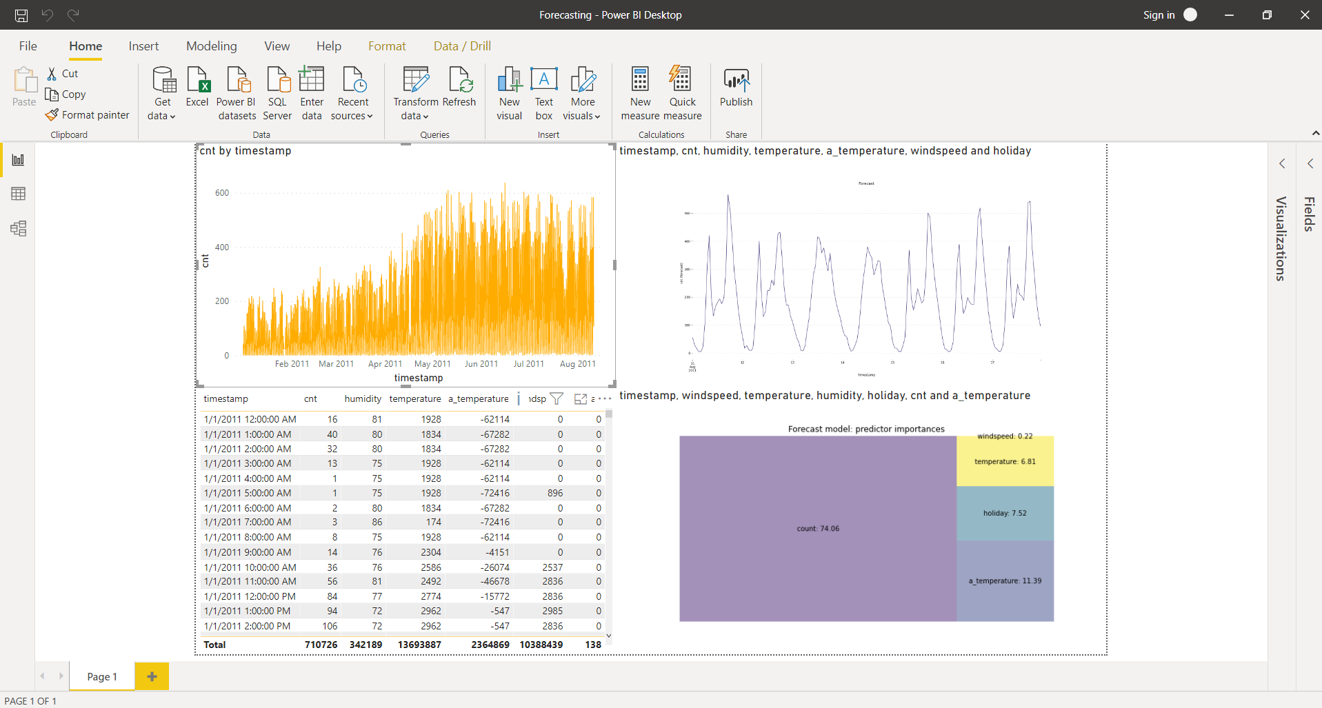
Power BI Forecasting Template
This use case handles RTInstantML forecasting and visualization of predictor importances. The necessary files for this use case can be downloaded here. This use case is based on a bicycle sharing dataset from Kaggle.
Credentials
Before starting to explore the actual dashboard, open the credentials.json file. Its content looks like this:
{
"license_key": "abcd-1234-efgh-5678",
"email": "tim.user@example.com",
"password": "password123"
}
Substitute the elements (abcd-1234-efgh-5678, tim.user@example.com, password123) by your license key, email and password, respectively, and save the file. The Python code in the Power BI dashboard will use this file to retrieve your credentials and add them to the requests.
Bicycle Sharing Forecasting Dashboard
Now, open the Forecasting.pbix file. The dashboard will look like this after following along this section.
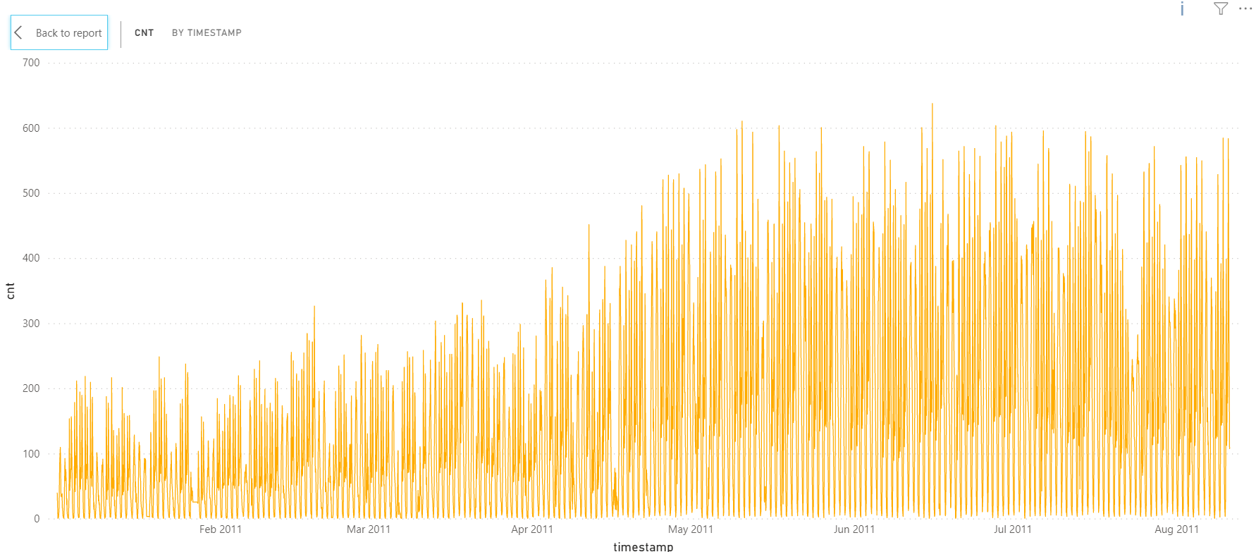
Target line chart
In the top-left corner of the dashboard, a line chart can be found visualizing the target variable over time. This variable, named cnt, represents the amount ('count') of people who are using the bicycle sharing service at a certain point in time.
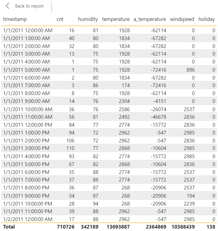
Dataset table
Right below this line graph, a table can be found. This table visualizes the entire dataset that is used in this use case. Each observations consists of a timestamp, a count and some additional information, such as the (normalized) humidity, the (normalized) temperature and feeling temperature in Celius, the (normalized) windspeed and whether the day is a holiday or not. Observations range from January 1st, 2011 at 12 AM to August 10th, 2011 at 11 PM. For the subsequent ten days (August 11th - August 20th), the count is not available; however, the other variables are.
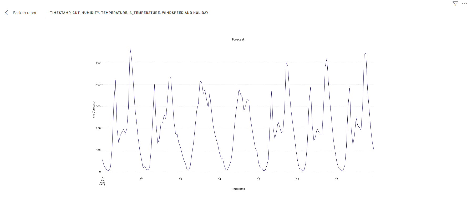
RTInstantML Forecast
In the top-right corner of the dashboard, the first Python script element can be found. The code contains comments explaining what is done in each section. Before the visualization can be correctly rendered, you will need to make a few adjustments.
- Add the link to the JSON file that contains your credentials. You can do this by replacing "PATH TO FILE/credentials.json" with the correct path in line 8 of the code:
with open('PATH TO FILE/credentials.json') as credentials_json: - If desired, indicate where the forecast should be saved. You can do this by replacing "PATH TO SAVE TO/forecast_result.csv" with the correct path in line 33 of the code:
forecast_result_df.to_csv('PATH TO SAVE TO/forecast_result.csv')If you do not want to save the forecast, you can comment this line out by adding a "#" to the start of the line.
This element visualizes the RTIntantML forecast of the cnt parameter. The configuration indicates a forecast should be made for the next 168 samples (line 21); since this dataset has an hourly sampling rate, this corresponds to forecasting the next week.
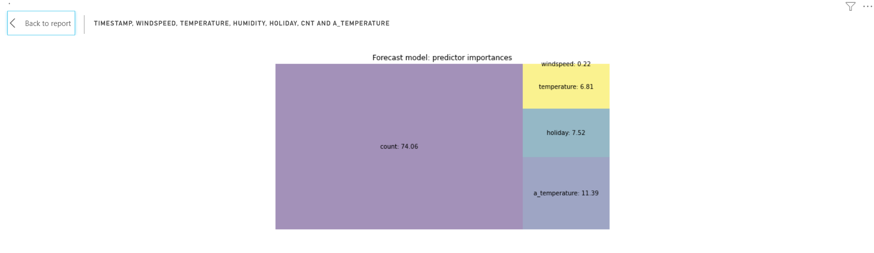
Predictor importances
Below this element, the second Python script element can be found. Here too, the code contains comments explaining what is done in each section. In order to correctly render the visualization, you will again need to add the link to the JSON file that contains your credentials. You can do this in the same way as described above (this time on line 9 of the code).
This element creates a treemap that visualizes the importance of the predictors in calculating the forecast.
After following along with this examplary use case, you're now ready to use the TIM Python client from within Power BI on your own datasets, to create your own visualisations and perform your own forecasting experiments. In the Solution templates section of the TIM Forecasting documentation, you can find additional datasets to use in your experiments. In the Power BI Anomaly Detection Template section of the documentation, you can find out how to use the TIM Python client from within Power BI for anpmaly detection.