Power BI Anomaly Detection Template
This use case handles anomaly detection and visualization of predictor importances. The necessary files for this use case can be downloaded here. This use case is based on a heat consumption dataset.
Credentials
Before starting to explore the actual dashboard, open the credentials.json file. Its content looks like this:
{
"license_key": "abcd-1234-efgh-5678",
"email": "tim.user@example.com",
"password": "password123"
}
Substitute the elements (abcd-1234-efgh-5678, tim.user@example.com, password123) by your license key, email and password, respectively, and save the file. The Python code in the Power BI dashboard will use this file to retrieve your credentials and add them to the requests.
Heat Consumption Anomaly Detection Dashboard
Now, open the AnomalyDetection.pbix file. The dashboard will look like this after following along this section.
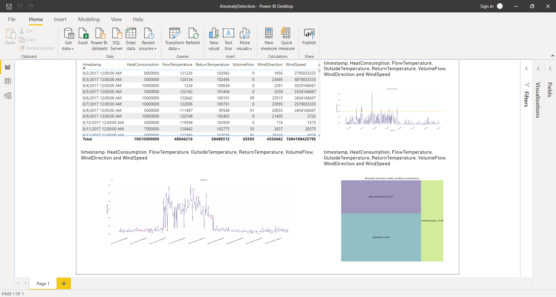
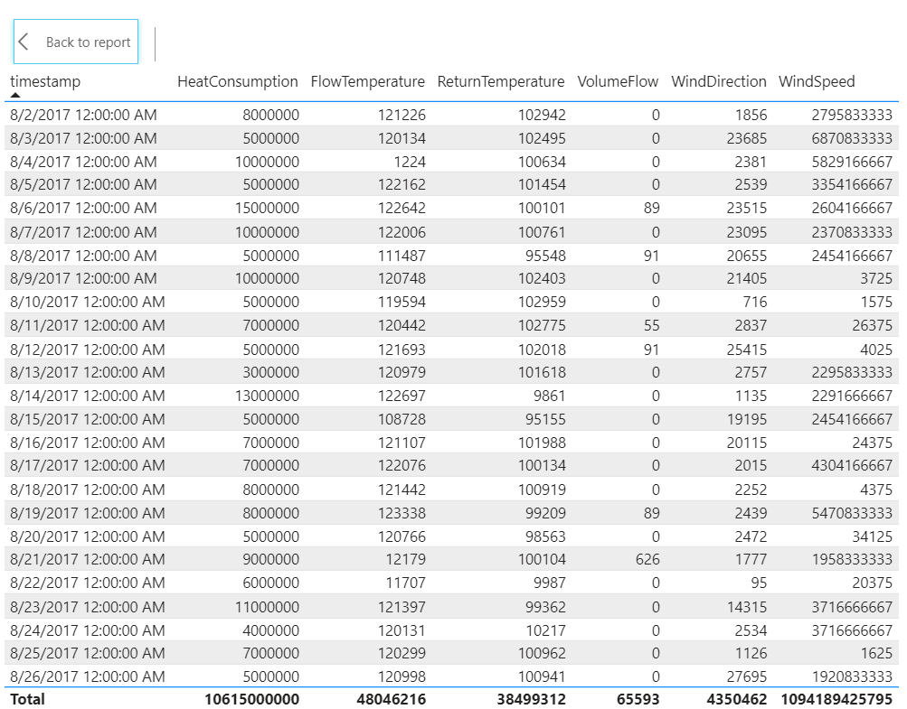
Dataset table
In the top-left corner of the dashboard, a table can be found. This table visualizes the entire dataset that is used in this use case. Each observations consists of a timestamp, a heat consumption and some additional information, such as the flow temperature, the return temperature, the volume flow, the wind direction and the windspeed. Observations range from August 2nd 2017 to October 25th, 2018. All variables are available up until the end of the dataset.
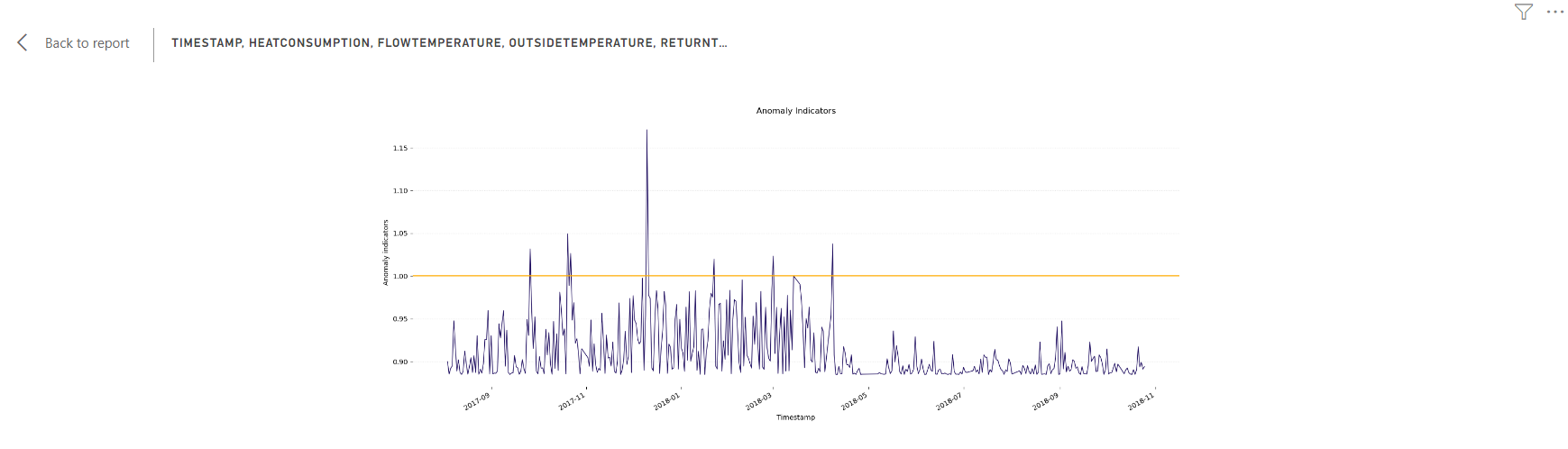
Anomaly Indicators
In the top-right corner of the dashboard, the first Python script element can be found. The code contains comments explaining what is done in each section. Before the visualization can be correctly rendered, you will need to make a few adjustments.
- Add the link to the JSON file that contains your credentials. You can do this by replacing "PATH TO FILE/credentials.json" with the correct path in line 8 of the code:
with open('PATH TO FILE/credentials.json') as credentials_json: - If desired, indicate where the anomaly indicators should be saved. You can do this by replacing "PATH TO SAVE TO/forecast_result.csv" with the correct path in line 33 of the code:
forecast_result_df.to_csv('PATH TO SAVE TO/anomaly_indicators.csv')If you do not want to save the anomaly indicators, you can comment this line out by adding a "#" to the start of the line.
This element visualizes the anomaly indicators and threshold. Each observation in the dataset is assigned an anomaly indicator, indicating how anomalous the observation is. When the anomaly indicator exceeds the threshold (orange line, value 1.00), the corresponding observation is considered to be an anomaly.
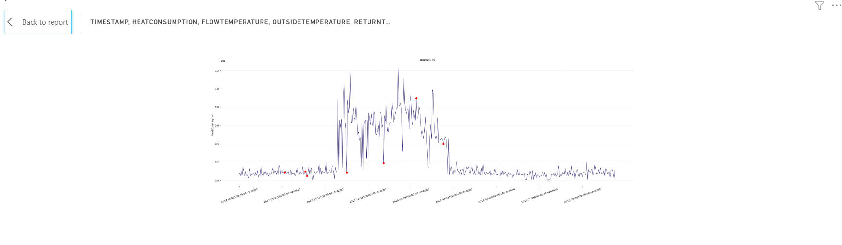
Target line chart and anomalies
In the bottom-left corner of the dashboard, the second Python script element can be found. Here too, the code contains comments explaining what is done in each section. In order to correctly render the visualization, you will again need to add the link to the JSON file that contains your credentials. You can do this in the same way as described above.
This element visualizes the target variable (heat consumption) over time. The detected anomalies are indicated with red dots.
Predictor importances
In the bottom-right corner of the dashboard, the third Python script element can be found. Again, the code contains comments explaining what is done in each section. In order to correctly render the visualization, you will need to add the link to the JSON file that contains your credentials here too. You can do this in the same way as described above (this time on line 9 of the code).
This element creates a treemap that visualizes the importance of the predictors in calculating the forecast.

After following along with this examplary use case, you're now ready to use the TIM Python client from within Power BI on your own datasets, to create your own visualisations and perform your own anomaly detection experiments. In the Solution templates section of the TIM Anomaly Detection documentation, you can find additional datasets to use in your experiments. In the Power BI Forecasting Template section of the documentation, you can find out how to use the TIM Python client from within Power BI for forecasting.